Let’s be honest. Most people trying to figure out how to make curved text in photoshop end up with something that looks like a 1990s PowerPoint slide. It’s frustrating. You’ve got a vision for a cool circular logo or a wavy social media graphic, but the moment you try to bend those letters, they stretch into unreadable digital taffy.
It doesn't have to be that way.
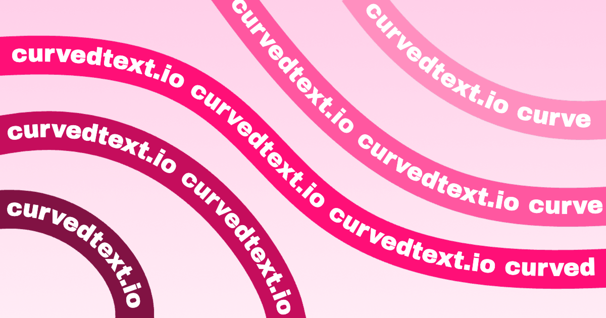
Photoshop actually gives you about three different ways to handle curves. Some are quick and dirty. Others are professional-grade. If you're doing this for a high-res print job, you can’t just "warp" the layer and hope for the best. You need vectors. You need paths. You need to understand why the "Type on a Path" tool is basically the only thing that matters if you want to keep your typography crisp.
The Warp Tool is a Trap (Usually)
Look, we've all done it. You highlight your text, click that little "T" with a curve under it in the top options bar, and select "Arc."
Boom. Curved.
But look closer. Notice how the vertical stems of your letters—like the legs on an 'H' or 'M'—are now slanted or fatter at the top than the bottom? That’s because the Warp Text feature is a global distortion. It’s stretching pixels or vectors based on a mathematical envelope, not actually placing the letters along a geometric line. It’s fine for a quick meme. It’s terrible for a professional brand identity. If you use "Arc Lower" or "Shell," you're essentially telling Photoshop to treat your text like a piece of rubber. It’s messy.
If you want the letters to stay proportional while the baseline follows a curve, you need to use paths.
How to Make Curved Text in Photoshop Using Paths
This is the "pro" way. It’s what designers at agencies like Pentagram or Sagmeister & Walsh would use if they were stuck in Photoshop instead of Illustrator.
First, grab the Ellipse Tool (keyboard shortcut U). Make sure the dropdown menu in the top left corner of your screen is set to Path, not Shape or Pixels. This is a crucial distinction. If you choose Shape, you’re creating a solid color block. If you choose Path, you’re creating an invisible mathematical line that only Photoshop can see.
- Draw your circle. Hold Shift while dragging to keep it perfectly round.
- Switch to the Horizontal Type Tool (T).
- Hover your cursor over the edge of the circle you just drew.
- Watch the cursor. It will change from a square-bounded I-beam to an I-beam with a wiggly line running through it.
- Click.
Now, your text is tethered to that circle. You can type "Fresh Roasted Coffee" or "Property of Nowhere," and it will wrap perfectly around the circumference.
Why Your Text Is Upside Down
It happens to everyone. You type the text, and it’s stuck on the bottom of the circle, staring at you upside down. It feels like a glitch. It isn't.
Photoshop uses "Path Selection" logic to move text around a curve. To fix this, you need to switch to the Path Selection Tool (the black arrow, shortcut A). Hover over the text until your cursor turns into an I-beam with two tiny arrows. Now, click and drag. You can pull the text to the top of the circle. If you drag your mouse inside the circle while holding down, the text will flip to the inside of the path. This is how you create those double-bordered seals where the top text reads normally and the bottom text is also right-side up but follows the bottom curve.
The Pen Tool Strategy for Custom Curves
Sometimes a circle isn't enough. Maybe you want your text to snake through a landscape photo or wrap around a person's shoulder.
Use the Pen Tool (P).
Again, make sure it’s set to "Path" in the top bar. Click once to set an anchor point. Click and drag somewhere else to create a Bezier curve. Don't go crazy with the points; the fewer points you have, the smoother your curve will be. Once you have a nice, elegant wave, grab your Type Tool and click on that path.
The beauty here is flexibility. Even after you've typed your words, you can go back with the Direct Selection Tool (the white arrow) and tug on the path's handles. The text will live-update, sliding along the new shape of the curve. It’s incredibly powerful for editorial layouts.
Kerning: The Secret Sauce
When you curve text, the spacing between letters (kerning) gets weird. Because the tops of the letters are further apart than the bottoms (on an upward curve), characters like 'W' and 'A' might start crashing into each other.
Don't leave it on "Auto."
Open your Character Panel (Window > Character). Highlight your text and hold Alt (or Option) while using the left and right arrow keys. This allows you to manually adjust the tracking. If you’re wrapping text around a tight circle, you almost always need to increase the tracking to keep it readable.
Dealing with Vector Smart Objects
If you find Photoshop’s path tools clunky—and let’s be real, they haven't updated the Pen Tool's soul since 2004—there is a better way.
Most pros do their curved type in Adobe Illustrator and then bring it into Photoshop as a Smart Object.
Why? Because Illustrator’s "Type on a Path" tool is significantly more robust. It has specific "Effect" settings like "Rainbow," "Skew," and "3D Ribbon" that Photoshop lacks. You can just copy the path from Illustrator, paste it into your Photoshop doc, and select "Smart Object." This keeps the type perfectly crisp regardless of how much you resize it. Plus, if you need to change a typo later, you just double-click the layer thumbnail, it opens back up in Illustrator, you fix the spelling, hit save, and it automatically updates in your Photoshop file.
Common Mistakes to Avoid
- Over-warping: If the vertical lines of your letters are leaning like the Tower of Pisa, you used the Warp tool too aggressively.
- Low Resolution: If you curve text on a low-res canvas (72 dpi), the "stairs" or jagged edges on the curves will be super obvious. Always work at 300 dpi if you’re doing any kind of transformation.
- Ignoring the Baseline: In the Character panel, there's a setting for "Baseline Shift." If your text feels too close to the line you drew, use this to float it a few points above or below the path.
Putting it All Together
Making curved text in Photoshop is basically a rite of passage for digital artists. You start with the Warp tool, realize it looks like a cheap strip mall flyer, and eventually graduate to Paths.
If you're building a logo, use the Ellipse tool as a path. If you're doing something organic, use the Pen tool. Always keep your Character panel open to fix the spacing.
The most important thing to remember is that Photoshop treats text on a path as a dynamic relationship. You aren't just "bending" pixels; you're telling the software to calculate the position of every character relative to a mathematical line.
Next Steps for High-Quality Design
- Check your anti-aliasing: Ensure your type is set to "Sharp" or "Crisp" in the top menu to avoid blurry edges on the curves.
- Convert to Shapes for Final Handoff: If you're sending your file to a printer or another designer who might not have your fonts, right-click the text layer and select "Convert to Shape." This turns your curved text into permanent vector paths that look the same on every computer.
- Experiment with Reverse Curves: Try drawing an 'S' shape with the Pen tool and see how the text handles the transition from a convex to a concave curve. It's the best way to master the Path Selection tool.
By focusing on paths rather than warps, you ensure your typography remains professional, legible, and scalable. It’s the difference between a "Photoshopped" look and a designed one.
The path method might take an extra 60 seconds, but in the world of design, those 60 seconds are the difference between amateur work and a polished final product. Use the Path Selection tool to fine-tune the start and end points of your text, and don't be afraid to dive into the Baseline Shift settings to get the positioning exactly where it needs to be. Keep practicing those Bezier curves; they are the foundation of everything you'll do in high-end digital imaging.